Reavy Viking
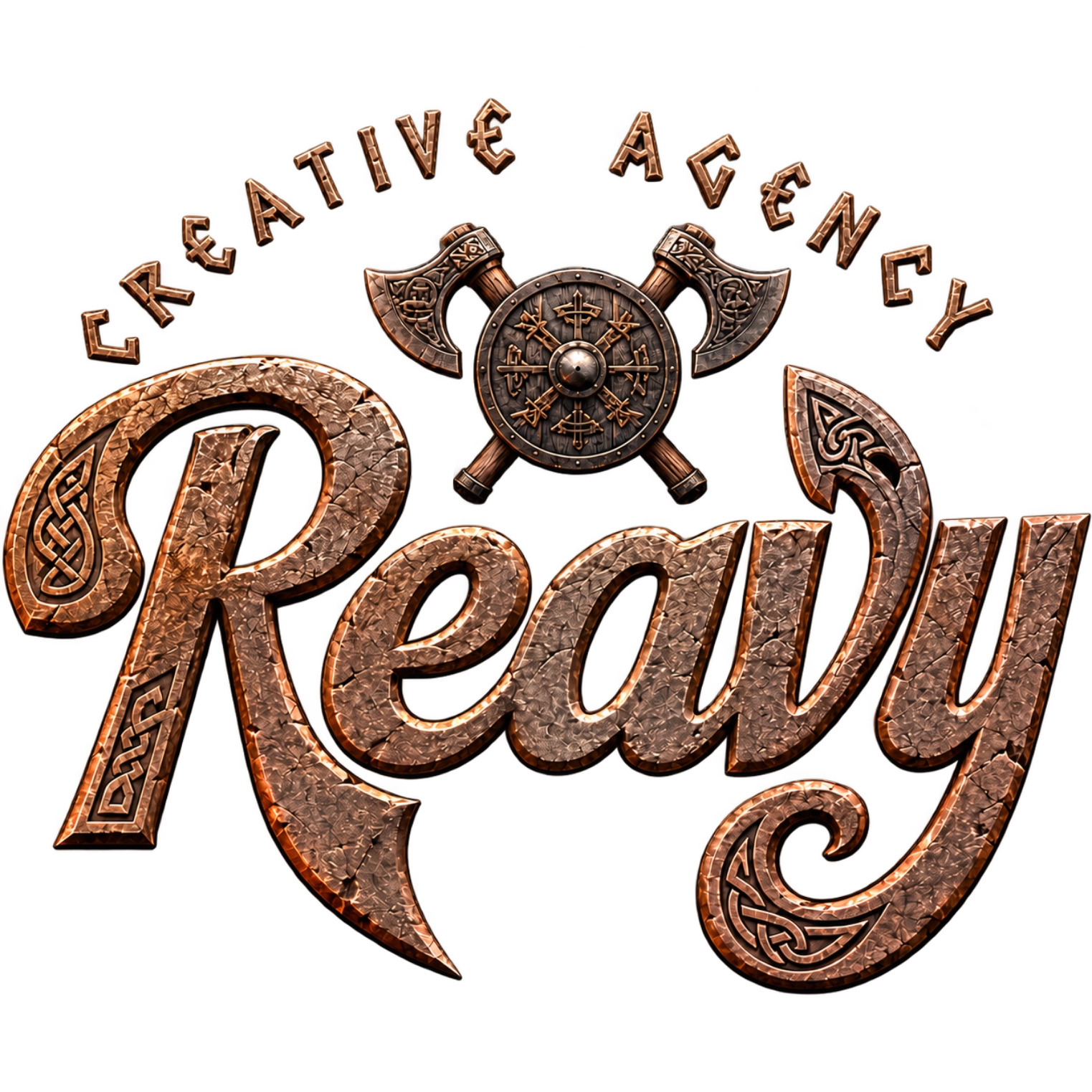
A viking-themed variant of the Reavy mark, built for expressive pieces.
Context
Reavy's primary mark is a script wordmark, designed to work in any application. This is an expressive variant: the name reads the same, the visual vocabulary moves somewhere else entirely.
What we did
Logotype in metallic relief with celtic carving along the strokes, crossed axes and a nordic protection wheel at the centre, all set on stone. The palette wasn't picked separately: it comes out of the material itself, oxidised bronze with crimson at the edges.
Result
The variant carries the name outside the corporate register without costing recognition: anyone who knows the brand reads Reavy at first glance, anyone who doesn't keeps the symbol. It coexists with the primary wordmark rather than competing with it — one is the system mark, the other is an expressive piece.
- Client
- Own brand
- Services
- Visual identityLogotypeArt direction
- Type
- Design
- Year
- 2026