Produza — Identity
The mark for a print-shop management SaaS, built in the industry's own language.
Context
Management software usually shows up with a generic tech mark: blue acronym, abstract icon, nothing that says who it serves. Produza sells to print-shop owners, and had to be recognised by them before any explanation.
What we did
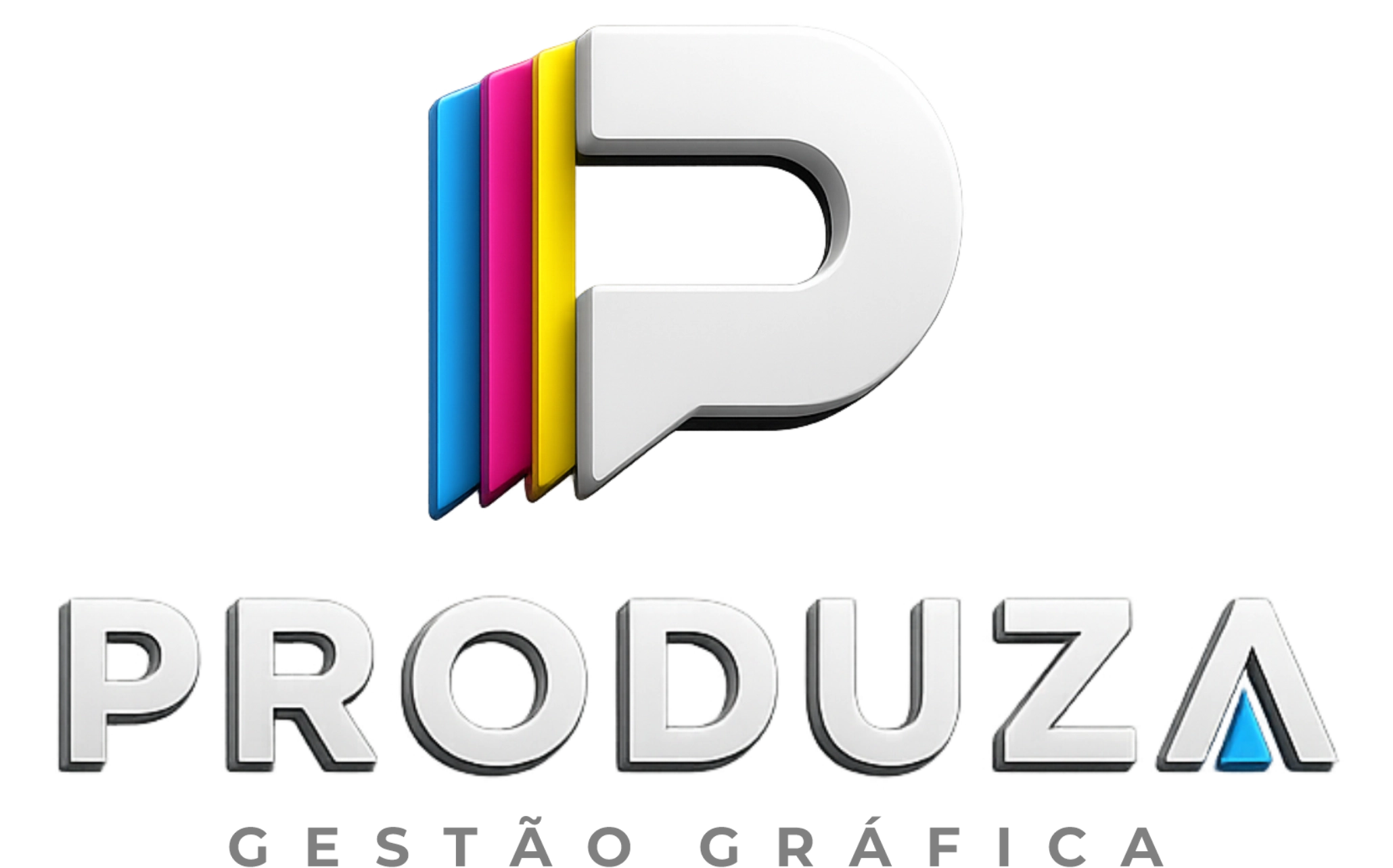
The monogram is a P in relief with cyan, magenta and yellow plates stacked behind it — the colour separation every printer knows, read as a sheet coming off the press. The same relief carries into the wordmark, and the cyan triangle inside the A repeats the reference without repeating the drawing.
Result
The mark is read by the right audience before the first paragraph: anyone who works with print recognises CMYK instantly. And the system holds both ends of the range, from favicon to shopfront, because monogram and signature work apart.
- Client
- Reavy Product
- Services
- Visual identityLogotypeBrand design
- Type
- Design
- Year
- 2025