Camarão Rei
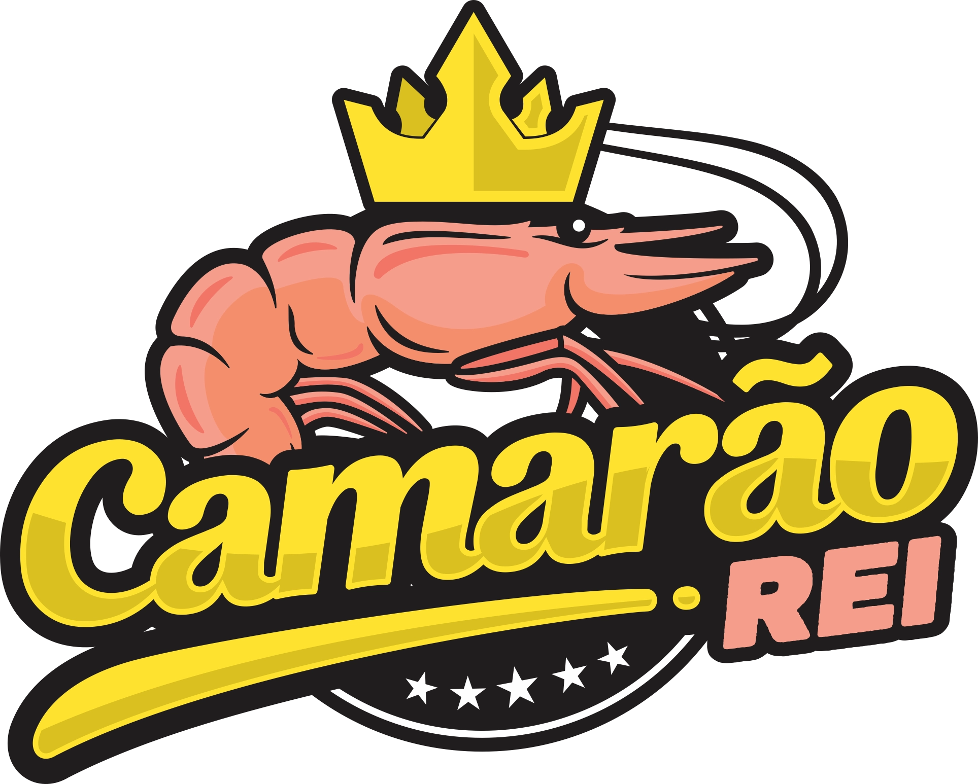
A restaurant mark that asks for no interpretation: the name is literal and so is the drawing.
Context
A restaurant façade is read from a car, ten metres away, in two seconds. An abstract symbol does not survive that. The name hands over the image ready-made — a shrimp that is a king — and the only wrong decision would be trying to be subtle.
What we did
A crowned shrimp on a crest, with a thick-outlined yellow script and “REI” in salmon, the colour of the animal itself. Heavy black outline throughout: that is what holds legibility over photo, over vinyl, over a coloured wall and on a lit sign at night.
Result
A mark that survives the worst real-world surfaces without losing legibility. The stars and the arc give the quality-seal air the segment uses, without having to claim anything in writing.
- Client
- Restaurant
- Services
- Visual identityLogotypeBrand design
- Type
- Design
- Year
- 2025