Instituto BEEyound
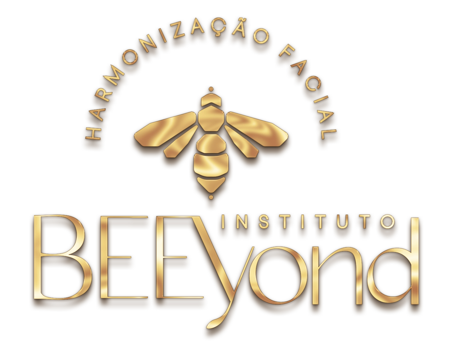
A mark for a facial aesthetics clinic, built on the pun already in the name.
Context
Facial aesthetics is the category most alike itself: thin serif, rosé, small leaf. No brand is remembered because they all speak the same vocabulary. The name already held the way out — BEE + beyond — and nobody in the segment owns a bee.
What we did
The bee is faceted in gold, drawn in geometric planes rather than illustration, which keeps it legible when reduced. “BEE” takes weight and uppercase against the handwritten “yond”, so the pun is seen before it is read. The arc with the segment closes the set like a seal.
Result
A mark of its own in a category without marks. The bee works alone as an avatar or a label, and the faceted gold carries the price positioning without falling back on the thin-serif cliché.
- Client
- Facial aesthetics
- Services
- Visual identityLogotypeBrand design
- Type
- Design
- Year
- 2025